
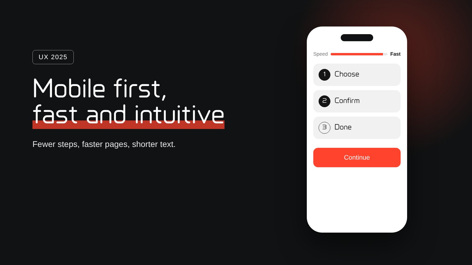
For years, websites were designed on a large desktop screen and then squeezed onto a phone. In 2025 that order finally flipped. For most businesses, the phone is no longer the second screen. It is the only screen many customers use, from the first search to the final purchase.
Mobile first means mobile only
Mobile first used to mean "make sure it also works on a phone". Today it means designing the whole journey for one thumb, a small screen and short moments of attention: on the bus, in a queue, between two meetings. Navigation, forms and buttons have to work without zooming or precise clicking. If a step only works well on a desktop, many users will simply never complete it.
Speed is the first impression
Before a visitor reads a single word, they experience how fast your page loads. On mobile networks every extra second costs attention, and impatient users go back to the search results. Page speed is also a factor in how search engines rank pages. Lighter images, fewer plugins and simpler pages are no longer technical details. They decide whether your story is seen at all.
People scan, they don't read
Users are less and less willing to read long product descriptions. They scan for the one answer they need and expect the next step to be obvious. That changes how we write and design:
- One clear message per screen
- Short labels and buttons that say exactly what happens
- Details available when needed, not forced on everyone
- A workflow that guides the user instead of explaining itself
The best interface is the one that needs no instructions.
AI changed how we test
Testing user journeys used to be slow and expensive. With AI, teams can now review flows, spot friction points and compare variations in a fraction of the time. That does not replace real users, but it makes it realistic to test early and often, even for small businesses with small budgets.
What this means for your business
The direction is clear, and it fits our mission of simplicity: fewer steps, faster pages, shorter text and a journey that feels natural on a phone. Start by opening your own website on your phone and trying to complete your most important action. Every moment where you hesitate is a customer you may be losing.
Want an honest review of your user journey? Request a complimentary consultation.
